As someone who’s been in the design game for a minute, I know the influence that font pairing can have on a website’s appearance. The act of blending two or more fonts is crucial to forming a visually appealing and cohesive website. When done right, the perfect font pairing can make all the difference, transforming a dull and unremarkable site into a beautiful and user-friendly one that captures and converts its audience. In this discourse, I’ll delve into the importance of font pairing in exceptional web design and highlight the key subtopics that are vital to success.
Establishing Visual Hierarchy
One of the foremost reasons for font pairing is to establish visual hierarchy. A well-chosen font pairing allows designers to emphasize the most crucial information on a website, making it easier for visitors to find and comprehend what they’re looking for. For example, a bold and large font can be used for headings to grab attention, while a smaller, less imposing font can be employed for body text to provide context. This visual hierarchy guides visitors through the site, allowing them to effortlessly find what they’re searching for and engage with the content.
Reinforcing Brand Identity
Font pairing is also essential in reinforcing brand identity. The right font choice can convey the tone and personality of a brand, setting the tone for the overall aesthetic of the website. For example, a playful and lighthearted brand may opt for a playful and cursive font, while a serious and professional brand may choose a traditional sans-serif font. It’s imperative to choose fonts that align with the brand’s values, goals, and character to ensure a consistent and cohesive brand identity across all touchpoints.
Enhancing User Experience
An optimal font pairing can also enhance the user experience on a website. The right font choice can make a site more legible and readable, making it easier for visitors to engage with the content. For instance, utilizing a font that is easily readable, such as sans-serif, can improve the overall readability of a site and allow visitors to focus on the content. Furthermore, variations of the font, such as bold and italic, can add visual interest and draw attention to crucial information.
Achieving Symmetry and Consistency
Finally, a top-notch font pairing helps to achieve symmetry and consistency on a website. By combining two or more fonts, designers can create a harmonious and cohesive look and feel, giving the site a professional and polished appearance. Additionally, by using a consistent font pairing throughout the site, designers can create a sense of unity and cohesiveness, making it easier for visitors to navigate and engage with the content.
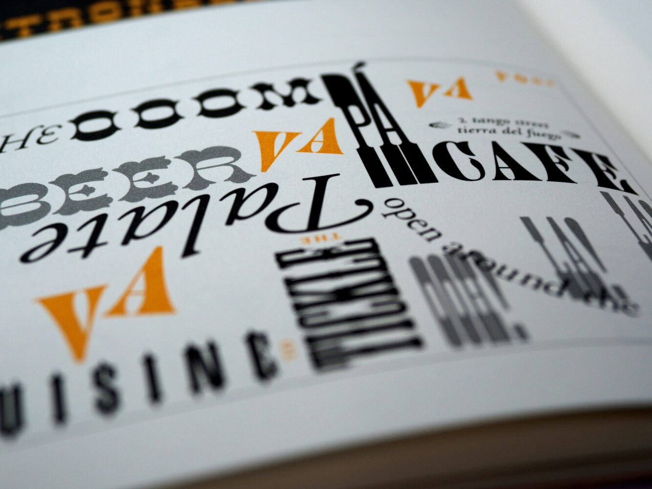
Let me tell ya, folks, the world of fonts is a massive one. You can spend a whole day sifting through the endless amount of free Google Fonts available. And when you finally find that perfect font for your website’s header or article, you’re left with the task of finding a complementary font that pairs nicely. It’s a daunting task, but it’s a crucial one in the realm of web design.
Now, Google Fonts, they got a section for you to dive into and educate yourself. But why waste your time when others have already done the heavy lifting? I personally like to check out a couple of sites that have the info I need, and I hit them up regularly.
https://heyreliable.com/ultimate-google-font-pairings/
AND
When browsing font pairings, it’s important to find one that represents you and your business. Don’t simply choose based on aesthetic appeal alone. Consider whether a font pairing, such as one used on a movie poster, aligns with the image you want to convey for your business, such as a law practice. Take the time to research and make informed decisions. Once you’ve found a pairing you like, give it some time to sink in. Step away for an hour, maybe even a day. If it still resonates with you, then that’s the one to go with.
Conclusion:
In conclusion, font pairing is a critical aspect of exceptional web design that plays a vital role in creating a visually engaging and user-friendly website. By establishing visual hierarchy, reinforcing brand identity, enhancing user experience, and achieving symmetry and consistency, font pairing can take a website to the next level, capturing and converting its audience. So, the next time you’re designing a website, pay close attention to your font pairing choices, and see how they help you create a stunning and successful site.